
TEAM
Creative Director
Micah Heiselt
Experience Lead
Angira Chokshi
Senior Designer
Soong Sup Shin
Helping more Americans save for a rainy day with Winwin Save.
Research showed majority of Americans didn’t even have $500 saved for a rainy day, but still found a way to spend more money on the lottery. WinWin Save was created as an engaging digital experience that taps into the psychology of gamification to help people save by engaging in that psyche.
DISCOVERY & BRAINSTORMING
Our initial research showed that our target audience, (low to average household incomes in the age range of 18-35) instead of having a savings cushion, spent a higher percentage of their income on the lottery. Considering the interests and priorities of our audience, in our brainstorming sessions we ideated how unlike traditional savings tools this savings solution would cater to the adrenalin of winning, by nudging users to save more. This would ensure the audience would enjoy the gamification of savings, and in turn build an emergency rainy day fund.


Quick thoughts and discussions
Our Approach
Categorization of the project experience
CHALLENGES
-
Our target audience is attracted by the excitement of the lottery - We can use the excitement and stickiness of the lottery and other games of chance to help people save money for future expenses.
-
Saving is not fun/exciting - Creating daily games and one mega draw for chances to win, could nudge users to save more - all the while keeping business and legal requirements top of mind.
-
Savings through gamification could be complicated - Help users develop an emergency fund by keeping it simple, painless and as a thoughtless act.
-
Best way to engage users to save - We also struggled with the usage of the app in the sense that would we rather have users visit the app often or spend more time on the app per session.


Explorations around the homepage - how simple is too simple?
INFORMATION ARCHITECTURE & ANALYTICS
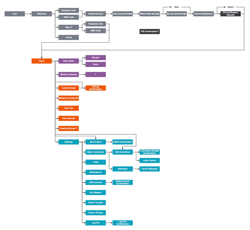
Considering the complications of savings through gamification, I worked out the app map and really simplified it. To conclude, we could have a one screen app with a "slide-up drawer" for additional buckets of information and a screen for the accounts section.
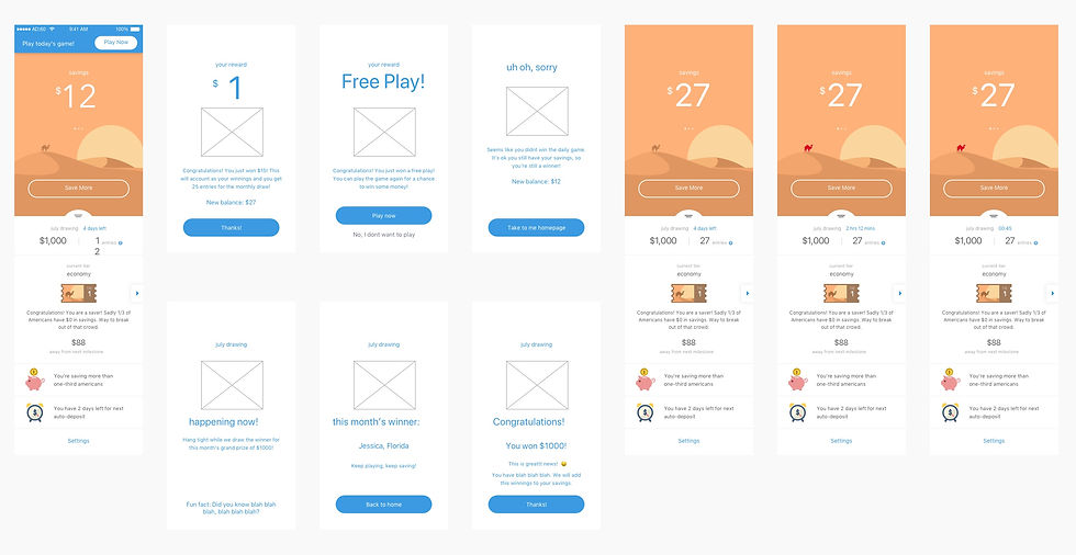
Based on the requirement to have a simple engagement interface, I created the wireframes for the app to ensure users engaged in a simple and fun manner. Further, based on the decisions the business made on engaging with the customer, I created the analytics document to be fed into google analytics/firebase, ensuring the business was able to learn from the users engagement to prototype better in the future.

USER TESTING & PROTOTYPE
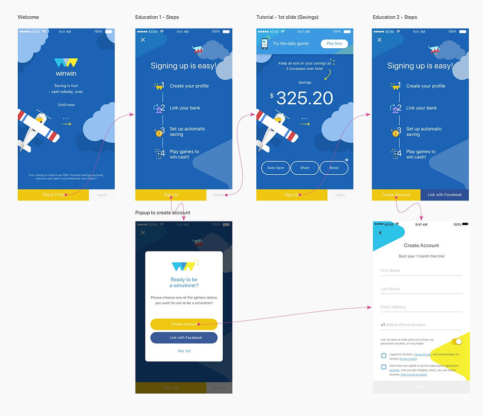
I wrote the script which focused on allowing users to discuss freely their financial situations and what and how they spend their money. Based on this, the team created prototypes which were sent for testing after which I analyzed the data and made certain updates for the final touches.
FUNCTIONAL SPEC. DOCUMENTS
I created functional specifications requirements documentation that gives in depth details about all the interactions a user experiences on each screen. These helped our developer and also our client to make sure we were always on the same page and never missed anything.

SOLUTION
The result is an app that offers new tools to enhance your practice, an expanded content library, and smart recommendations that change your experience based on the time of day.
